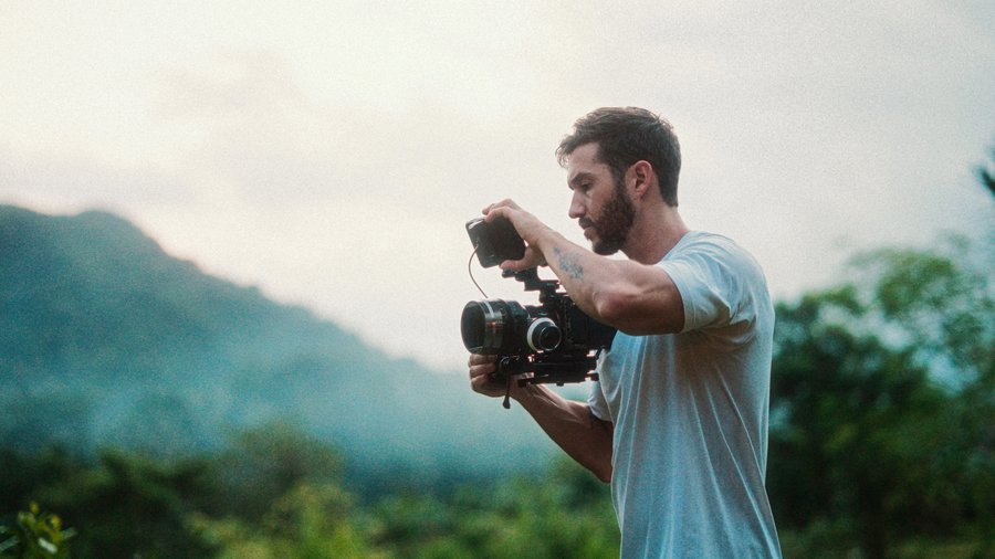
This was a real client project: I was hired as the colorist for Deja, an incredibly talented musical artist based in the UK. Her requirements: look good, keep it realistic (not too filmic), and make it vibrant and bright. I normally grade in Color Finale 2 Pro, but since most of you don't own it, we're building this entire look with Final Cut's native tools.
The video was shot in one location, a racetrack, which makes a colorist's life easier: one grade to design instead of many. The catch: no external lights, all natural sun, shot around 3pm (they only had access from 2 to 5), which is far from the best light of the day. We make it work.
Step 1: The input LUT, and the exposure trick
The footage is S-Log3, so grab the Custom LUT effect and load an S-Log3 to Rec 709 input LUT, one made specifically for your log profile (camera manufacturers give them away free; third-party ones exist too). Use an input LUT rather than hand-building contrast and saturation with wheels; doing it manually is a surefire way to skew your colors negatively.
Applied, it looks terrible at first. More importantly, check for blowouts: press Command 7 for scopes and watch the luma waveform. The trick: your log footage's trace should sit centered around 50 IRE BEFORE the LUT, because the LUT just expands outward from wherever the exposure sits. Ours sat high, and his ring was clipping, erasing detail. Critical detail: fixing this AFTER the input LUT can't recover anything. Add a color wheels correction before the LUT in the layer order and lower global exposure until the trace centers. Boom: detail back, shot properly exposed, ready to grade.
Step 2: Contrast and saturation
New color wheels (new corrections always stack at the bottom, after the LUT, which is where look adjustments belong). Lower the shadows toward 0 IRE without crossing it (scrub the whole clip; one darker section forced me to ease back up). This shot takes most of its contrast from the midtones, so pull those down a good amount.
Here's a nuance most tutorials skip: don't reflexively raise your highlights to 100. In a dim shot, raising highlights can push your subject's SKIN up too, and skin belongs roughly between 25-30 and 75-80 IRE. I cropped the scope into Deja's forehead, found it slightly hot, and pulled the highlights back down instead. Then global saturation up, vibrant but not crazy. (Reds and yellows always over-saturate first from a global push; we handle them next.)
Step 3: The complementary look
She wanted realistic but with punch, so we build a subtle complementary color scheme: two opposite colors on the wheel (orange and cyan here), creating color contrast that adds depth and pop. It's all over Hollywood for good reason.
Add a Hue/Sat curve. In Hue vs Hue, pick the blue and swing it toward cyan: watch the vectorscope compress all the blues toward cyan. Stylized, still natural. Then Hue vs Sat: pull down the intensity of the reds and yellows, carefully avoiding her skin (which lives in orange). Then Hue vs Luma, the dangerous curve, tiny moves only or it tears your image apart: I darkened the greens slightly, purely personal taste.
Step 4: Cleanup
Second Hue/Sat curve (a separate one, so I know what's what). Luma vs Sat: pull saturation out of the very darkest parts, a minor drop-off at the black point. This is a surefire cleanup after you've pushed color around. Sat vs Sat: raise the least saturated areas, lower the most saturated ones, balancing everything. Then a final nudge darker on shadows and lower mids.
Last check: crop into her skin on the vectorscope. For a natural look, skin should touch the skin tone line (rules are made to be broken in stylized grades, but not this one). Ours needed a small push: Hue vs Hue, select her skin, swing it onto the line. Done.
Bonus: the fake Pro-Mist filter
I put this in draft one; Deja vetoed it as too dreamy, but it's too good not to teach. Option-drag the clip up to duplicate. On the top copy, add the free Luma Keyer and drag the slider until only the brightest areas survive (disable the bottom clip with V to see what you're doing). Then a Gaussian blur on the top copy: amount low (around 8), blur boost way up. Re-enable the bottom clip and the highlights now glow with a soft, dreamy halo, like a mist filter on the lens. Some clients will love it. Some will send it back. That's the job.
Realistic, vibrant, client-approved. If you learned some tricks here, the masterclass goes ten times deeper on every one of these steps.
Build a professional color workflow in FCP
The FCP Color Grading Masterclass covers everything from technical correction to bold creative grades, featured on Apple's official Final Cut Pro Resources page.
Explore the Color Grading Masterclass