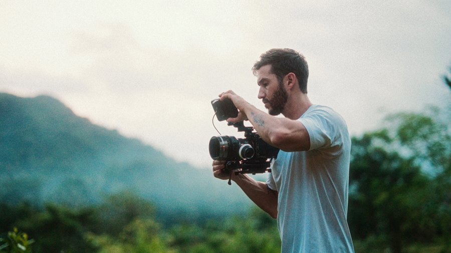
It's raining outside, so let's chill back and do something a viewer requested: a very simple, couple-step grade that gets you more than a balanced look. It has some style to it, it's beginner friendly, and it's quick. The clip was shot on the Sony a7S III in 4:2:2 10-bit S-Log3.
Step 1: Convert to Rec 709
Log footage first gets converted to Rec 709, either with the color wheels or (easier) a LUT specific to your camera, usually free on the manufacturer's website; this is Sony's S-Log to Rec 709. Not shooting log? Skip this step, but I do recommend log: it preserves the most dynamic range, keeping detail in the brightest and darkest parts of your shot and giving you flexibility to push things around in post.
Step 2: Contrast and saturation
Open scopes with Command 7. Our shot sits low on the luma waveform, and a well-exposed shot generally starts near the middle, so raise the global exposure to center it. Then contrast: shadows down, staying above 0 IRE so we don't erase detail. And here's a stylistic choice: I'm leaving the highlights where they sit, LOW. This footage feels documentary-filmic, not commercial, and film often keeps its highlights muted. A commercial look would push them up; we're not doing that. Finish with a touch of saturation.
Step 3: Balance via the RGB overlay
The shot's close but not balanced: on the RGB overlay, red separates from the pack, especially in the highlights. This was shot near sunset, so some warmth is honest, but not this much. Go to the red curve and pull down from the midtones (shadows at the curve's bottom, highlights at top); watch the RGB overlay converge. A hair of green out, a touch of blue in, and a slight S-curve on the master to lift her skin and dip the shadows for oomph. That's the whole correction.
Step 4: The cross-process look
New color curves for the style, a digital take on the old film cross-processing technique: on the blue curve, add blue to the shadows and reduce blue in the highlights. Then the red curve, flipped: less red in the shadows, more in the highlights. Adjust green to taste (mine sat fine as is), and add a bit more contrast. Instant complementary colors: her orange skin popping against the cooled blue background.
Step 5: The professional cleanup
This is where footage starts looking professional, for lack of a better term. Luma vs Sat in the Hue/Sat curves: eyedropper the darkest part (her hair), pull the saturation down with an anchored point so the rest of the image is untouched. Her hair goes from a gross blue to a natural tone while the midtone blues stay rich. Same little dip at the highlight end; my range check flagged a slightly oversaturated patch and the curve fixed it.
Optional: shape the light
If you have time for more, be a cinematographer in post, shaping light with shape masks. Open a color board (I use the board so I can tell my mask layer apart in the list), draw a big oval mask around her, click Outside, and gently drop the highlights and mids. Check her skin on the inside via the waveform: skin generally sits around 40 to 70 IRE depending on complexion, and she's right in range. Widen the feather so the edge disappears, and look how much she pops. Films do this constantly; nobody watching ever knows.
Optional: fake halation and grain
Option-drag the clip up to duplicate. On the top copy: Luma Keyer, drag the shadow slider until only the brightest areas remain, then a Gaussian blur with a slight boost. Soft glowing edges, dare I say cinematic. Finish with a film grain overlay: blend mode to Overlay, opacity to taste, Option-drag to extend it across the timeline (Option Right Bracket to trim).
Recap: LUT conversion, muted-highlight contrast, RGB overlay balancing, cross-process curves, saturation cleanup, then optional light shaping and halation. Save the whole stack as a preset and this becomes a one-click starting point for every project. Have a great week!
From first grade to full confidence
The FCP Color Grading Masterclass takes you from simple recipes like this one to designing professional looks from scratch. Featured on Apple's official Final Cut Pro Resources page.
Explore the Color Grading Masterclass