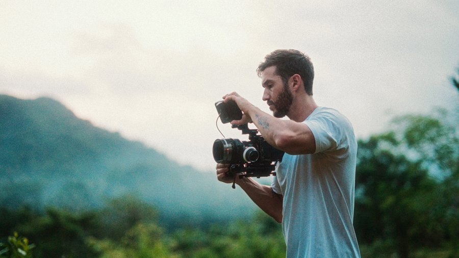
Look at this shot. Now look at this one. Why does the second seem more interesting and engaging? A little digital motion added in post. Movies, documentaries, and TV shows do it constantly, and once I point it out, you'll notice it everywhere. Here's every trick I use to spice up boring footage.
Trick 1: Digital motion done right
You may know you can click the crop button and use the Ken Burns effect for a slow push-in. The problem: applied per clip, the motion starts slow and speeds up on EACH clip, so back-to-back shots don't flow. The fix: press Option A for an adjustment clip, stretch it over multiple shots, and apply Ken Burns to THAT, setting the end point where you want the move to finish. Now the motion travels through shot A into shot B at one continuous rate.
Ken Burns still has that stop-start easing, though. The paid fix, and one of my most-used plugins, is Pro Zooms from my good buddy Dylan Bates: the Pro Burns presets do the slow push with on-screen positioning, an onion skin view to keep your subject locked in the same spot during the move, built-in sharpening, and, the setting I touch most, easing you can switch to constant for a perfectly even glide.
Trick 2: Smooth slow-mo you didn't shoot
Shot at normal frame rate and wish it was slow motion? With the clip selected, open the retime menu and hit Smooth Slow-Mo (or press Command R, think "command retime"), drag the clip out to slow it, then in the retime menu set video quality to Best (Machine Learning). Final Cut uses voodoo magic to blend frames so it genuinely looks shot in slow motion.
Trick 3: An actual color grade
Most people don't realize how much of "boring" is just an ungraded shot. The quick workflow from the video: pull your shadows down toward 0 on the luma waveform so darks look dark, leave highlights alone if they're near 100 (don't erase detail), and set midtone brightness for pleasing contrast. Skip the saturation slider if the added contrast already enriched your colors; on the vectorscope, stay inside the imaginary line between the color targets or you're clipping.
Then get creative with secondaries: a color mask on the shot's dominant reddish orange (view mask, refine with the HSL controls), then adjust OUTSIDE the mask, pushing in cyan, the opposing color, for color contrast and depth. Add an isolation mask: color curves with a shape mask around your subject, affect the outside, pull the lower midtones down, and the viewer's eyes go exactly where you point them. Balance with Sat vs Sat (lower the most saturated areas, lift the least), then one more shape-masked curve as a wide, soft vignette. Cap it with the digital motion from trick one, and I'd say this footage is pretty spiced up.
Trick 4: Magnetic mask magic
Drag the radial blur effect directly onto your subject in the viewer, select your subject (and foreground), Analyze, Done. The blur lands INSIDE the mask, so hit invert, dial the amount way back, adjust the feather, and now the background falls away into a dreamy blur that reads like an anamorphic lens. Bonus: throw on the free Prism effect for chromatic aberration around contrasty edges. Technically a lens flaw. Looks great anyway.
(Thanks to Artlist for sponsoring the video version: their image-to-video AI animated a still of a desolate trailer park so I could magnetic-mask myself into it, and their voiceover tool can now re-voice your own narration while keeping your exact pacing. Two months free with my link.)
These color techniques are just a preview of what's possible.
The FCP Color Grading Masterclass is the most complete course on color grading in Final Cut Pro, featured on Apple's official resources page. It covers everything from basic corrections to full cinematic looks, step by step.
Explore the Color Grading Masterclass5. Magnetic Mask + Radial Blur (Dreamy Background)
This one works great for portraits and talking-head shots. Use the Magnetic Mask to isolate your subject, invert the mask so effects apply to the background only, then add a Radial Blur effect to the background. Set a low amount with a high feather for that soft, dreamy out-of-focus look that feels almost anamorphic.
Layer in the Prism effect on top of the whole clip for chromatic aberration around high-contrast edges. Small touch, but it elevates the shot significantly when combined with the background blur.