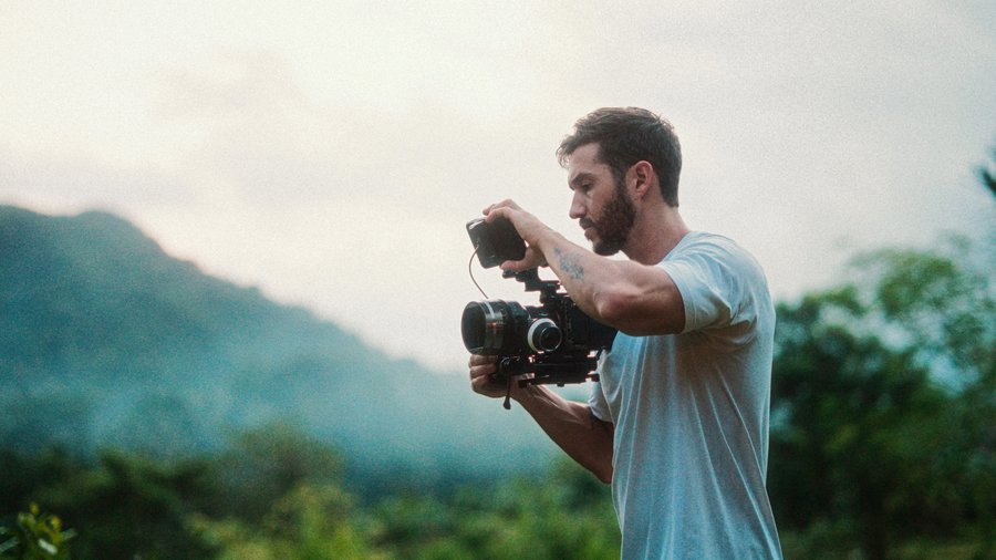
Teal and orange is that color mood scheme you see all over Hollywood and, honestly, all over travel videos, maybe a bit too much. I'm not the biggest fan of it myself, but art's subjective. If you want to pull off a teal and orange grade like Sam Kolder or Benn TK without spending a dime on oversaturated LUT packs, here's how, using a free effect that's already in Final Cut.
Drop on the built-in effect
This is almost anticlimactic because it's so easy. Go to your effects browser, type teal and orange, and drop the built-in effect right onto your footage. That's your base.
Tweak it in the inspector
Head to the effect's controls and make a few adjustments. Move the slider to the right to protect your highlights, and bring your shadows down a touch. Then open the color board and pull your midtones down to add some more contrast. Already it's looking a lot more filmic than the default.
Tame the greens (optional)
This last one's a stylistic choice to match the look those guys go for. To make your greens less saturated, open a Hue/Saturation curve, go to Hue vs Sat, click the color picker dropper, grab some green from your shot, and pull that point down until you like what you see. And that's it, a clean teal and orange look for free.
Go beyond the preset
The FCP Color Grading Masterclass teaches complementary color theory and the full professional workflow, so every look you build starts from understanding. Featured on Apple's official Final Cut Pro Resources page.
Explore the Color Grading Masterclass