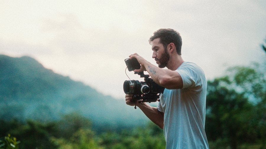
For this video portrait I shot tons of footage and used maybe 10 percent, for a final video under two minutes. Here's the full breakdown of how it came together: organization, structure, motion, overlays, and the color grades, including one shot I nearly ruined.
Organizing: favorites, then keywords
Pass one: go through every clip, mark in and out points on the sections you like, and press F to favorite them. Pass two: within those favorites, tag smaller sections with keywords (Command K). I created a "best" keyword, went through everything again, and then, still drowning in good takes (Katie is such a professional that I loved almost every clip), added a "love" tier on top. Favorites are the rough outline; keywords are the scalpel. When your shoot runs hours, this laddered filtering is what makes the edit possible.
Structure: shorter and grouped
My first cut ran 2:15, alternating beach and jungle back and forth. Reviewers said it was good but way too long, and I felt the repetitiveness too. The fix was cutting it down hard and reorganizing by location: a few forest clips, then the grassy area, then the beach. Even without a real story, grouping created coherence. Honest truth: placing and organizing shots takes longer than anything else in a project like this, color grading included.
Motion and overlays
I added subtle scale-in moves throughout (presets from MotionVFX's mMusicVideo, but you can do it free: transform tool, keyframe at the start, scale up slightly at the end). Light overlays came from Lens Distortions' Classic Light Hits: set the blend mode to Screen (not overlay), reduce opacity, then, the key move, add a shape mask pushed to the frame edge where the light source lives and feather the hell out of it, so it reads as a natural sunlight glow instead of a filter.
Only two transitions in the whole piece (I use fewer and fewer in passion projects): a light transition that happened to line up with sunlight peeking through the trees (slightly cheesy, but it works), and a film burn. Then there's the Super 8 section: a dirty sprocket frame from the CinePacks overlay pack, plus dust, scratches, a drop-frame effect for that choppy frame-rate feel, light leaks, grain, and selective blur. Pairing that analog aesthetic against digital footage is a look I really enjoy; you may hate it, and if so, tell me.
Shot matching and eye flow
I match shots on subject position, camera motion, color, even sound. One shot holds longer because she appears to drop down the tree exactly as the artist sings "I'll be your daydream." And with quick cuts, keep the viewer's eyes in one place: face center, face center, eye, hand, all landing in the same region of frame. One shot only worked once I zoomed it in so your eye didn't have to travel. Everything zooms in as the music builds to the drop, then releases into a long shot with a scale-out. I also built a fake rack focus: adjustment clip, defocus effect, keyframed from blurry to sharp across the cut, blending two shots with the music.
The grades
All graded in Final Cut with Color Finale 2 Pro, the closest FCP users get to DaVinci Resolve grading (its HSL masks are Resolve's qualifiers, and unlike FCP's native version, you can BLUR the mask, which prevents the color breakage you get when pushing hard).
Jungle shots: global exposure down so the log-to-Rec-709 LUT sits right, then contrast and saturation, then an HSL mask on her skin (selected via hue and saturation only, avoiding her eyes) with blur smoothing the edges. Her skin ran way too warm, so the gamma wheel swung away from orange until she landed on the skin tone line. Then hue curves for a purple and gold complementary look: leaves pushed toward gold, shadows toward purple, with Hue vs Sat and Hue vs Luma taming the greens and yellows.
Beach shots: a clean, simple cyan and orange grade: cyan up in the shadows and down in the highlights on one curve, orange doing the exact reverse on another, then a soft inverted-S for a less contrasty feel and the sky's blue nudged toward teal. (I turned this look into a LUT you can grab on my LUTs page if you want the beach look ready-made.) One caution that will save you: if your log shot sits bright, around 75 IRE, adding the LUT pushes it past 100 and bakes the clipping in. Lower the global exposure BEFORE the LUT layer, always.
The rescue job: one Helios-lens shot had my white balance set wrong. Horrendous. The salvage: find the dominating contaminant colors in the color curves and pull each down, a tracked shape mask isolating her from the background (CF2P tracks these automatically), green pulled out and saturation restored inside the mask, more curve surgery on the oranges and pinks, skin pushed back to the skin tone line via a blurred HSL mask, a tiny mask to desaturate her glowing red ear, and a tracked ellipse-plus-HSL mask to gently brighten and saturate just her lips. (I tried Beauty Box, but it softened her skin too much and she didn't need it.) Not the best shot in the film, but proof that even a wrecked white balance is salvageable with the right adjustments.
That's the whole portrait: disciplined selects, location-grouped structure, restrained motion, analog texture, and grades that serve the subject. Every technique here is expanded in the masterclass below.
Give your portraits a signature look
The FCP Color Grading Masterclass teaches the color side of cinematic storytelling, from clean correction to fully stylized film looks. Featured on Apple's official Final Cut Pro Resources page.
Explore the Color Grading Masterclass